
In my role, I bridge both the online and print sides of the publication. This year, innovation has been my priority. We've rethought our overarching approach to design and experimented with radically different ideas.
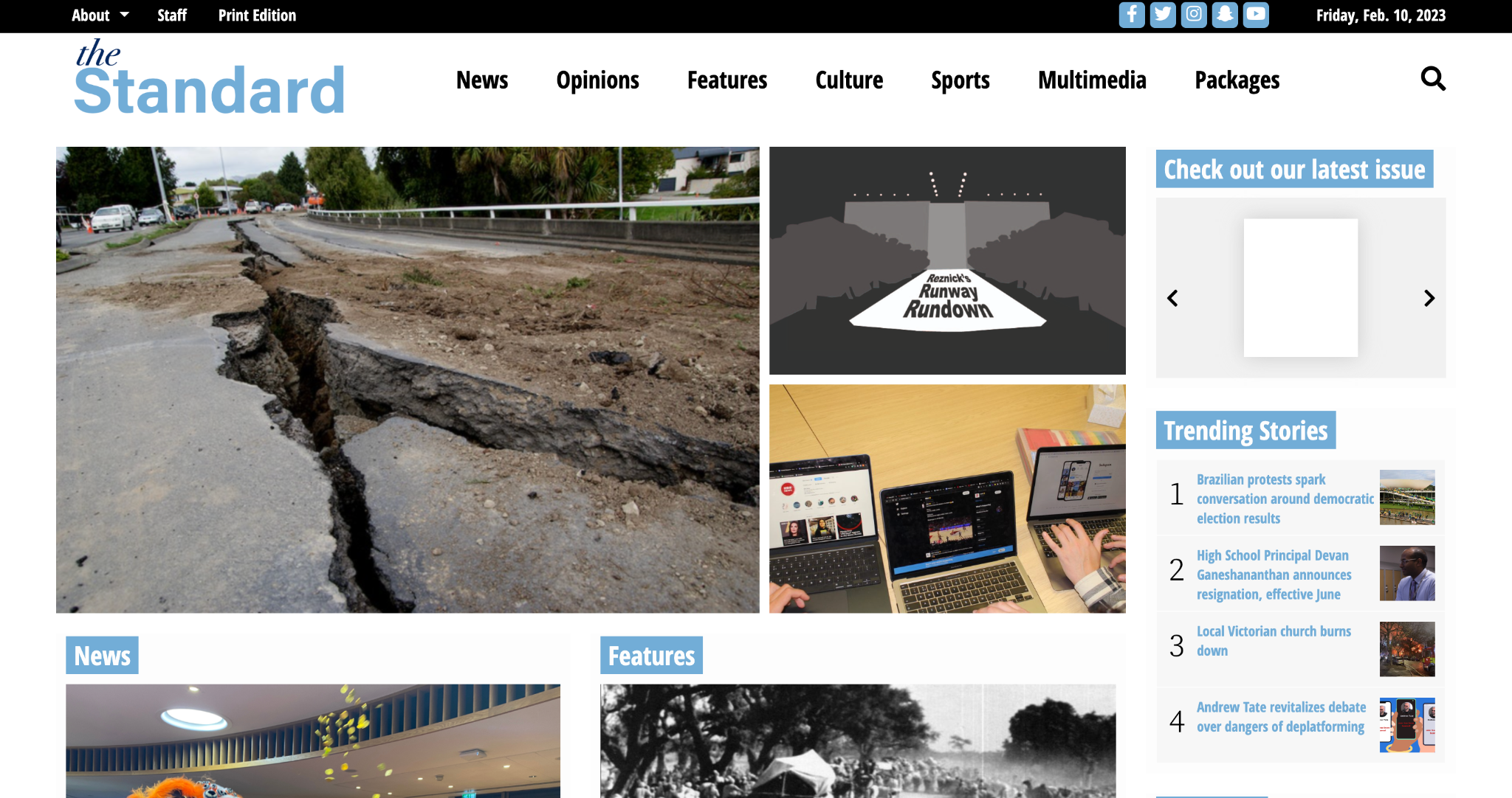
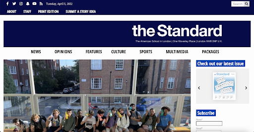
The look of the homepage on our website is the first thing with which the reader is met. Right after stepping into my role, I assisted my DEIC: Online in re-designing this homepage and our website banner. This new design included a series of changes detailed below:
New:
Old:
No reader in the modern day wants to read a story with just text. So, in every story, we include a featured image and pull quotes to break up big blocks of writing. However, I’ve encouraged every staffer to include some kind of alternative element in their stories, whether infographics, photo galleries or polls.
Below is a story of mine entitled "School implements pedagogical, organizational changes adhering to Ofsted requirements" that had a particularly thought-out online design, made with the intention of gripping the reader and conveying the story in a way the text alone simply cannot. I included three forms of multimedia – two visually expressing information given in the article to help the reader's understanding and the second a timeline providing a detailed evolution of changes to the school. Pull quotes were placed strategically (alternating on the right or left sides) to break up text between each multimedia element.
My story about sexual harassment also had a carefully designed online template. I used Sno's long-form story template to break up each subsection, complete with multimedia and additional photography. Click the photo to view the story design:
The climate change package is one of the best examples of my web design. Aside from designing the container story – adjusting headline size, subhead spacing and facilitating graphic design – each story I laid out had pull quotes, multimedia and other elements to draw the reader's eye beyond the text. Click the image below to view the package as a whole, and each individual image in the grid to explore the individual designs of each story:
Print similarly underwent a redesign. This year, my DEIC: Print and I made the decision to scrap “themed issues” – articles grouped under a one-word category – and instead create cohesion with issue colors, based on feedback from our editors. Each print cycle, we determine these colors and share them print editors.
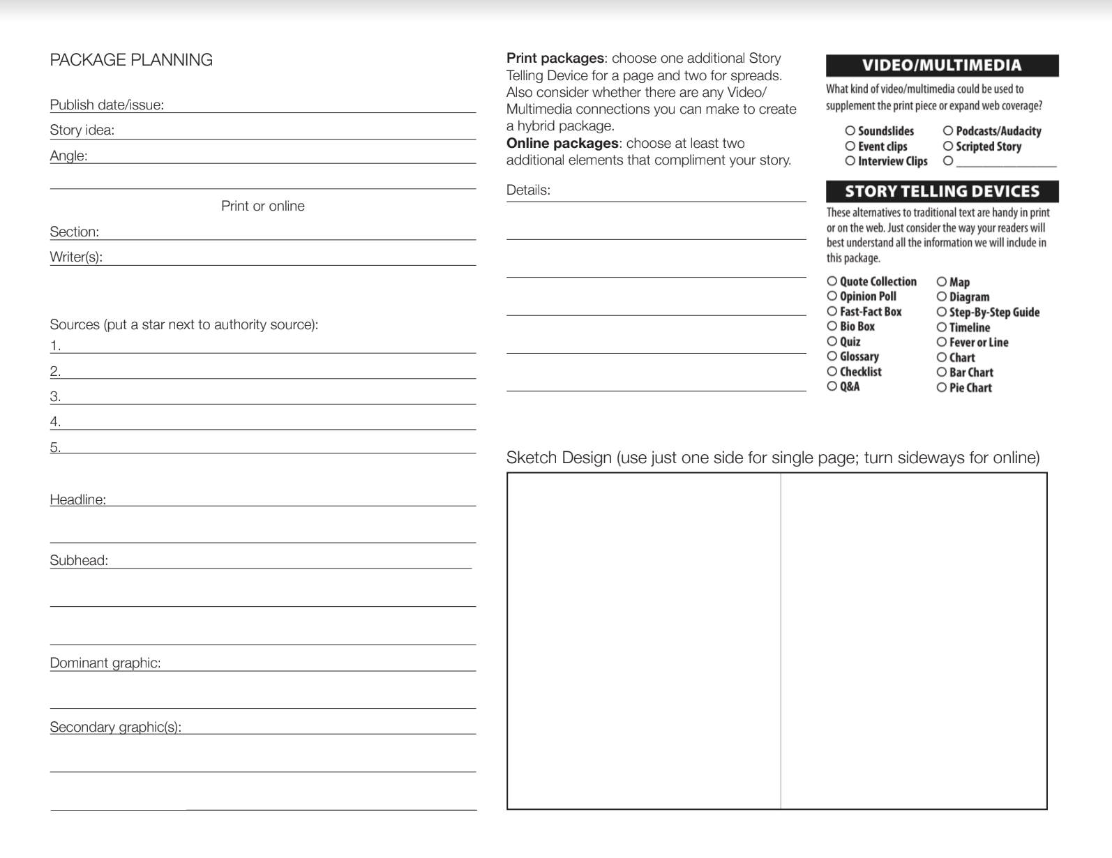
To emphasize the importance of considering page design early on in the cycle, I have made package planning sheets precedence. Each print page must be include something we can't replicate online. Each print cycle, we sit down during class to work on these sheets, planning out every element to mitigate design repeat and galvanize idea generation.
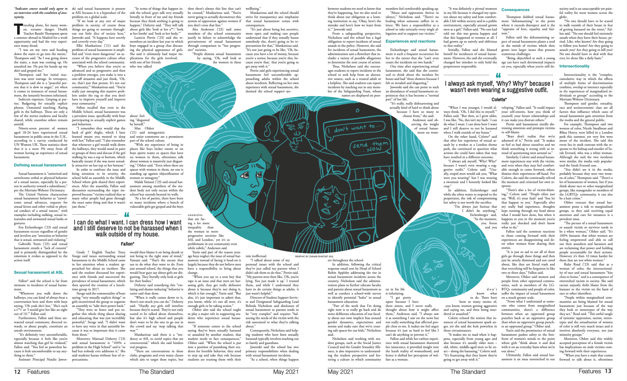
A key part of print design is thinking about how content is best presented on the page and what space is dedicated to each piece in a particular issue. This year, I've had multiple discussions about how much space we dedicate to certain issues. I strongly believe that stories uplifting the voices of marginalized communities should be highlighted in our print designs. For example, with my sexual harassment piece, we dedicated a four-page spread. For my article on body image, we similarly chose to pursue a four-page spread design to signify the weight of the topic.
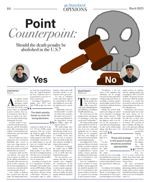
As a leader, it's also been important to encourage differing perspectives and reflect on how those differences can manifest in our design. Recently, two reporters wrote a point-counterpoint about the death penalty in the U.S. In the design of this page, we made sure that the two columns – for and against its abolishment – should be placed alongside each other as to not prioritize one viewpoint over the other.

Beginning with my journey with print journalism, I felt like a fish out of water. Adobe was my biggest enemy. The first time my role required work with print, I was simultaneously mentoring two other editors in using these programs. The summer before stepping into my hybrid position, I watched video after video on YouTube giving step-by-step InDesign tutorials and explored each principle of design. Now, I don’t where I would be without print design. Below are a few examples that stand out. Click each item to view a reflection:


From the first PDF for the packet process to dropping the final PDF in the press folder, a page rarely stays the same – it shouldn't. Below are examples of a few pages I oversaw from start to finish and the changes they underwent:
This spread, exploring the closure of affinity groups, underwent a significant redesign. I guided the editor laying out this page in playing around with typography for the headline, considering the placement of the dominant graphic and use of pull quotes. I also encouraged her to connect her statistic elements with her graphic. In this case, the fish tank connected with the water bubbles displaying survey results on the opposite page. We also talked through color cohesion, playing with a palette of blues and oranges to align with our issue colors.
While more subtle, this page also underwent a redesign. For the second page of the spread, I loved the idea of the editor's initial draft, but felt it was a bit cramped and each image was floating around the iPhone graphic. Thus, I suggested she play around with that page to create a photo collage incorporating the phone graphic with pull quotes alongside it.


This piece about school colors was the "spotlight" spread for our second issue. The designer had some amazing, cohesive elements at the start of the process, so throughout our layout week, I coached her in refining the elements and shifting their position on the page. We played around with the headline – e.g. physically dividing the word "divide" with our school colors – and reworking the tree design to ensure it had a purpose and wasn't merely decoration. We shifted the sidebar to the far right of the page and moved the photo elements to the bottom of the text as well.
An increase in pushing out social media content coincided with a re-design. Each post now contains a title within the photo itself, a banner at the bottom signaling the section and part of the caption in the image:
Before:

After:

